First Impressions…
Last nights class was interesting. We had some extra time left over so the teacher pulled out his training CD-ROMs for the 747-400 and we went through the hydraulic and landing gear systems.
The first thing that I noticed was the “user interface” with the plane systems. It was a mix of digital (EICAS) and analog (solenoid and magnetic switches). The layouts of the switches make sense if you know what to look for.
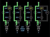
 There are two EICAS systems. Both run on CRTs and are named Primary and Secondary. The image on the left is the hydraulic system as you would see it on the Secondary EICAS display. You can see the status of the auxiliary pump (on system 4) and the engine driven pumps (EDPs). Quantity, temperature, and pressure are also displayed.
The logic of which error message to display when has definitely gone through a lot of thought. If, for example, a low hydraulic pressure message is displayed, but then later on the entire hydraulic system fails (say in system 4) then that message will take precedence. The Primary EICAS only displays the most important message to the pilot.
The second way of interfacing with the pilot is by analog switches. These switches are magnetically controlled so that they can be “reset” by the airplane automatically. An example of this would be the “auto brake” switch.
The switch contains 6 settings: RTO, Off, Armed, 1, 2, 3, 4. RTO is the “rejected take-off mode”, Armed means that the system is on, but not selected to any setting. The numbers represent the deceleration speed selected. The deceleration (from memory) is from 4 feet/s2 all the way up to 11 feet/s2.
Let’s say for example the pilot has set the auto land to setting 2. The plane lands but is not stopping quick enough and the pilot applies the brakes manually. This causes the auto land system to disengage and the switch will automatically flip to the “armed” setting.
It seems that Boeing is caught between the “old way” and the new digital way of doing things. I’m curious to see how Airbus handles the same situations.

I think this is an excellent way of doing things.
You’re trained to fly the plane manually, so if any automatic systems fail, you are still the decision maker with physical access to all the switches.
It is simple and logical. It works how people expect it to work, and removes guess-work. All hallmarks of a good User Interface IMO…